PLATFORM
Printer Application
ROLE
Senior Product Designer
TOOLS
Figma • Azure DevOps
DURATION
Nov 2024 – Sep 2025


Secure the $164M contract with the United States Department of Agriculture by bringing full accessibility, keyboard navigation, and compliance with the new Xerox Interface Design System (XIDS) to the Xerox Workplace Suite printer application.
Objective
Documented detailed design specifications for 5” and 10” interfaces for all of Xerox’s printer screens. Set up additional asynchronous meetings with development leads and individual developers to allow for questions regarding accessibility behavior.
Execution
Focused on understanding the hardware and software constraints with system engineers. Met with teams to understand VPAT and APR documentation for accessibility requirements. Relied on XIDS and UX heuristics to create a user-friendly and WCAG 2.2 AA accessible application.
Approach
Met the September 2025 deadline for the launch of Xerox Workplace Suite’s printer application and won the contract as the USDA’s top choice for printing. This project also resulted in a step forward in Xerox’s brand guidelines for documenting accessibility for designers and developers. The project brought a great user interface to 100,000 employees across 16,000 devices and 3,500 offices.
Impact
Before and Afters
Below are some before and afters of how the user interface had improved.
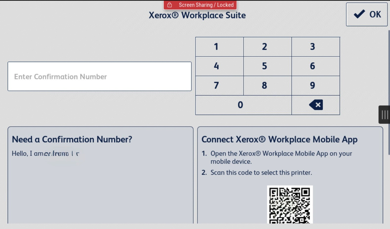
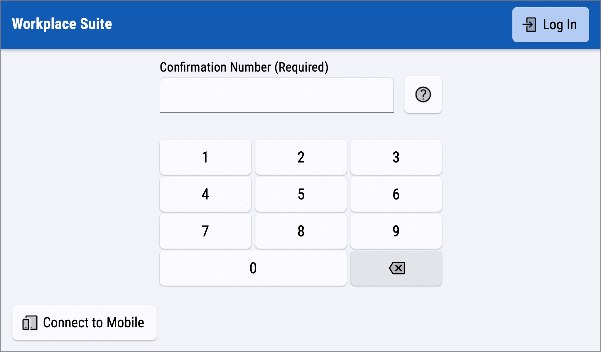
Previously, the landing screen and number pad displayed a lot of information, requiring users to scroll for additional details like confirmation numbers and QR codes. Progressive disclosure on this screen allowed employees to focus on logging in while new users accessed only the necessary information.
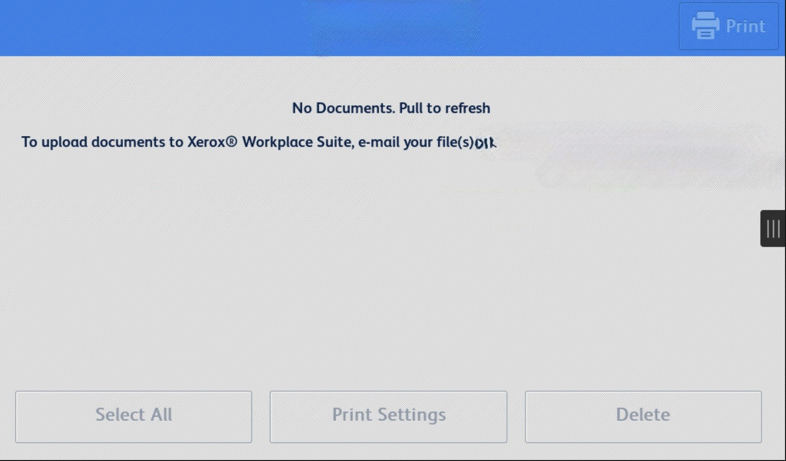
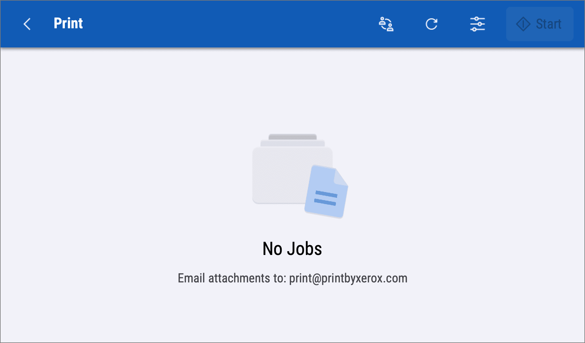
Initially, the application relied on using a gesture model to refresh the page. For accessibility reasons, gestures are often hard to execute. Instead, a simple, familiar refresh button was added to the global navigation.
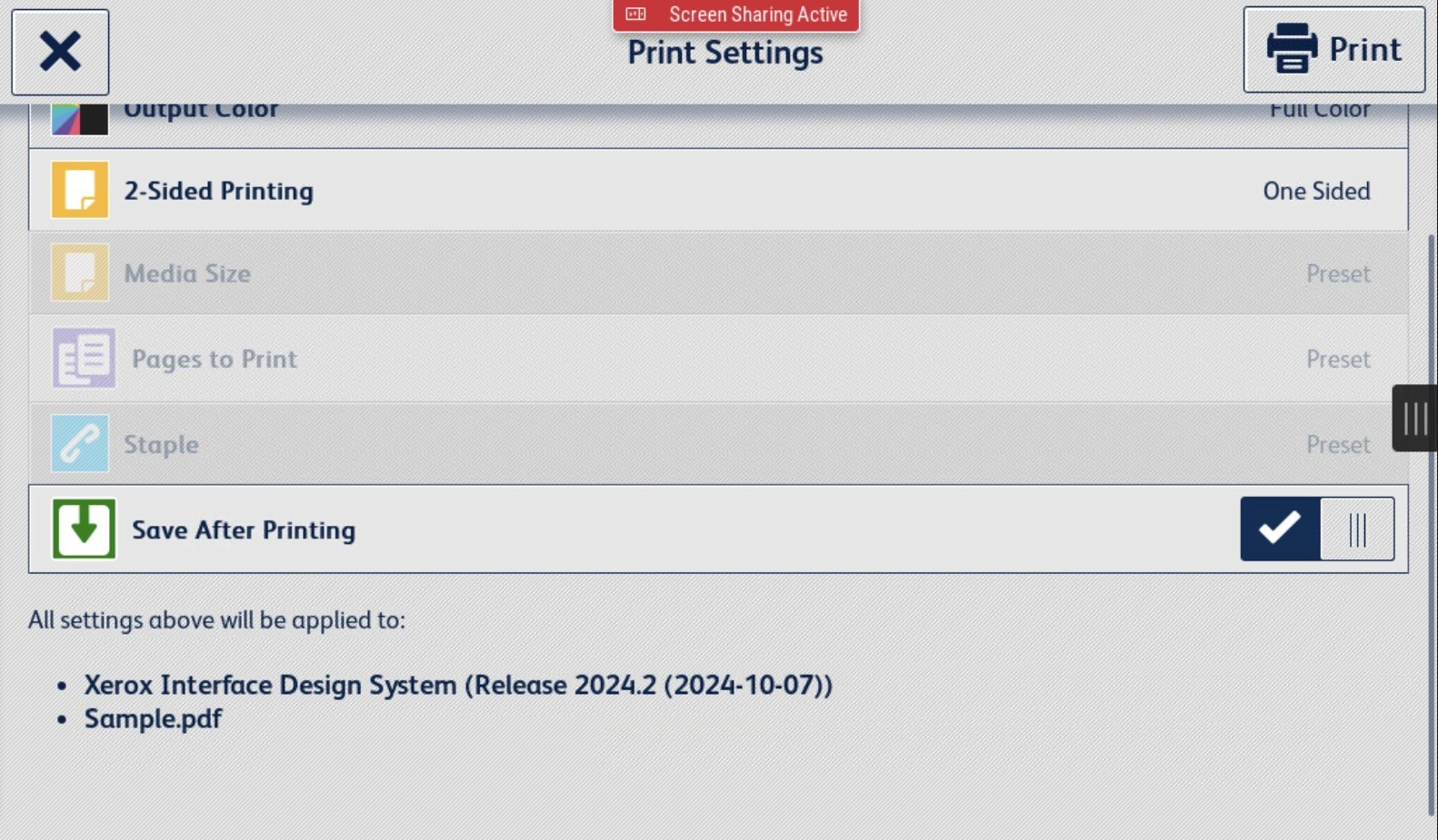
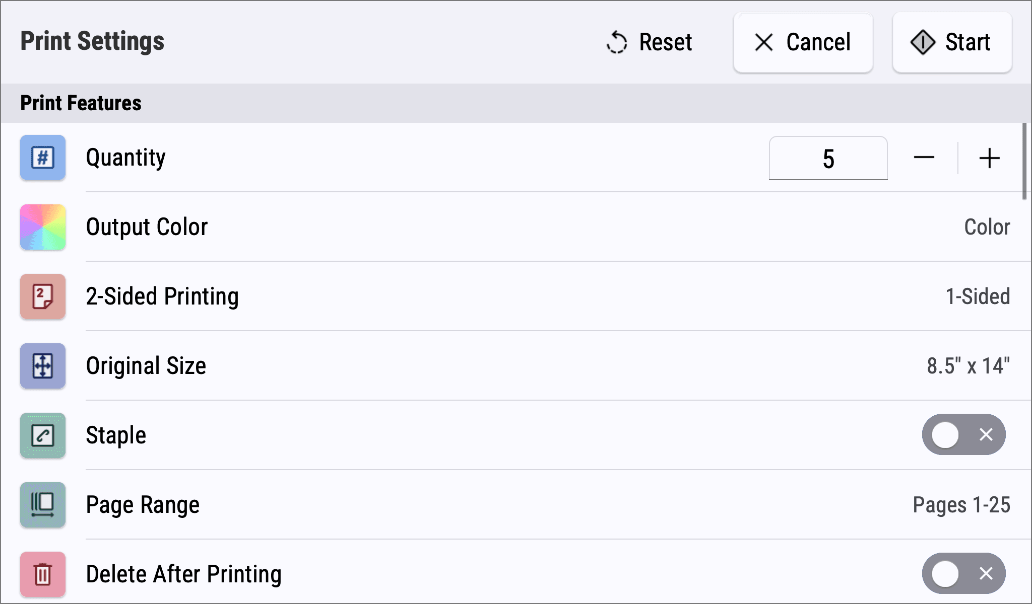
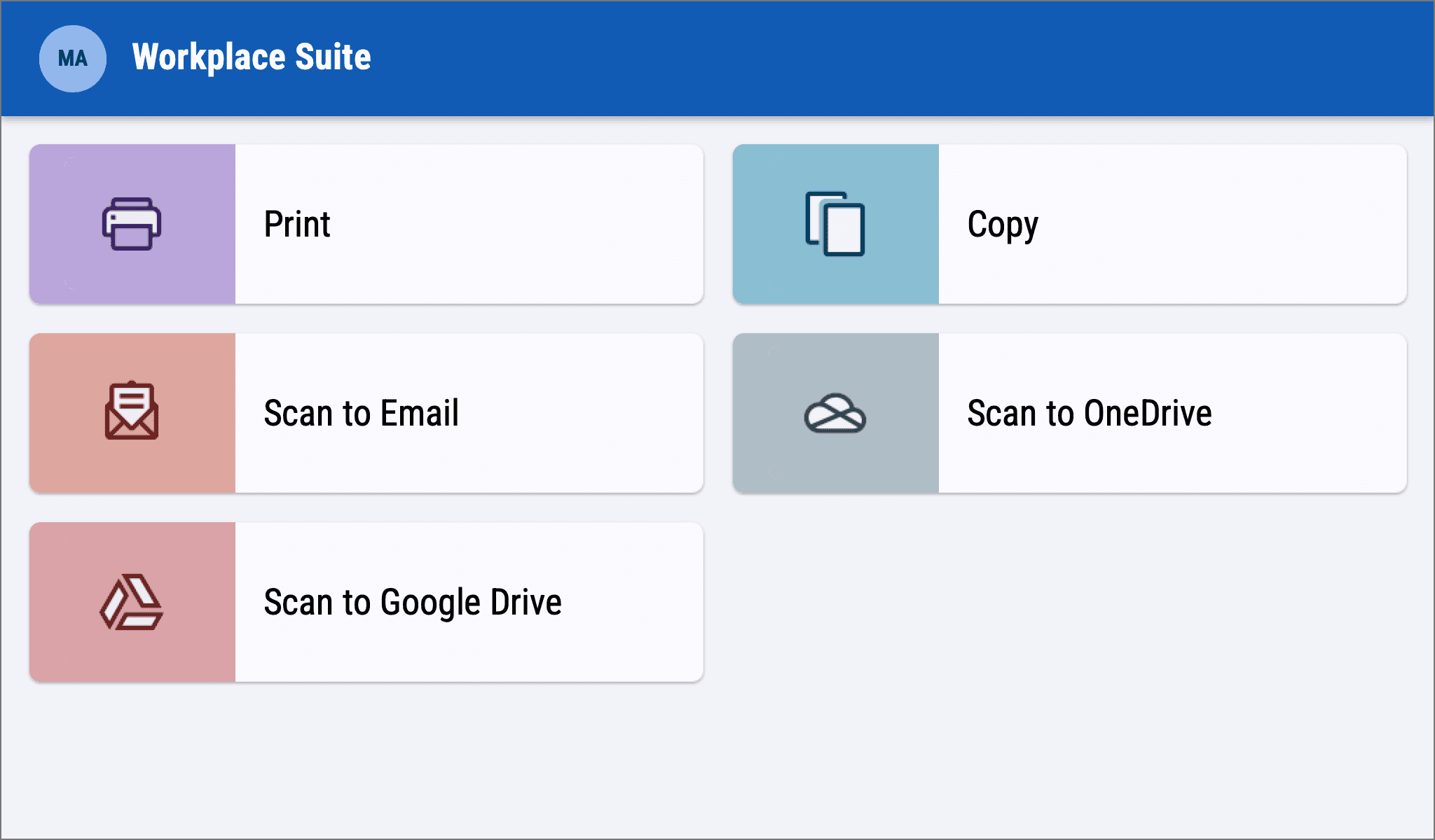
The list of features (settings) users can adjust was updated to better reflect partner applications and other Xerox-based software solutions. Therefore, this brought consistency and improved navigation as users knew what to expect when it came to changing settings.
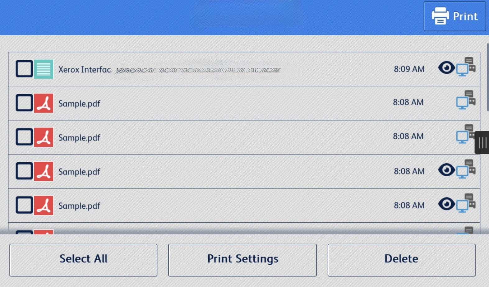
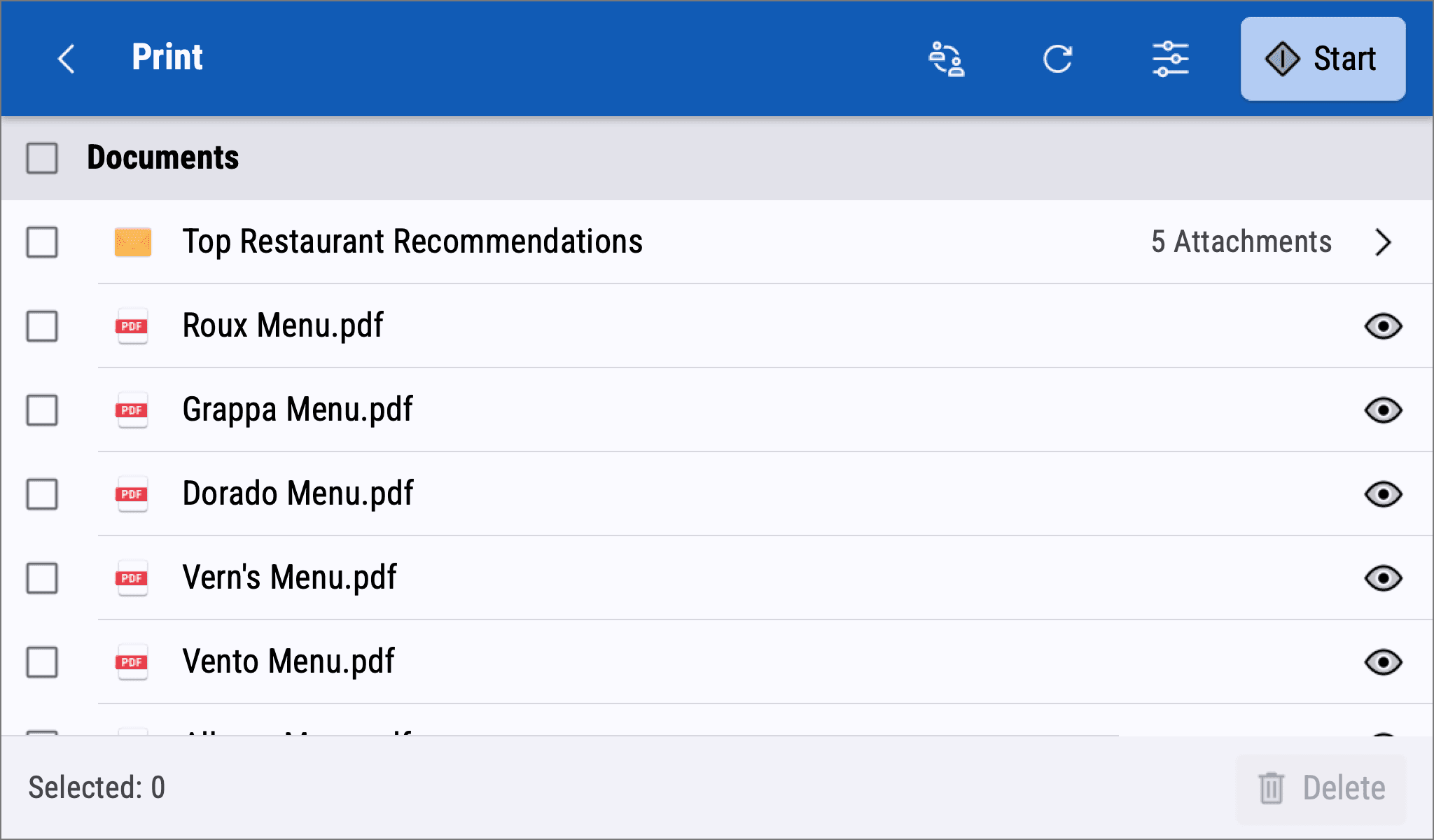
List items previously were misaligned, had poor contrast, and resulted in heavy scrolling. Instead, I introduced a clean and simple way to navigate and view documents that mapped the jobs to UX conventions found on similar platforms.

